How to make a chart in Word documents
Charts and graphs turn numbers into easy-to-understand pictures that help your readers get your point quickly. When you’re putting together a business report, school project, or proposal, adding a chart lets people see patterns and compare data right away.
In this guide, we’ll show you how to create pie charts, bar graphs, flow charts, and more using ONLYOFFICE Docs as an example, a powerful, open-source office suite. You’ll also learn how to format your charts for a clean, professional look.

How to insert a chart in a Word document
Creating a graph in a Word document is quick and intuitive. Here’s how to do it:
- Open your Word document in the editor.
- Place the cursor where you want the graph to appear.
- Navigate to the Insert tab, then click Chart.
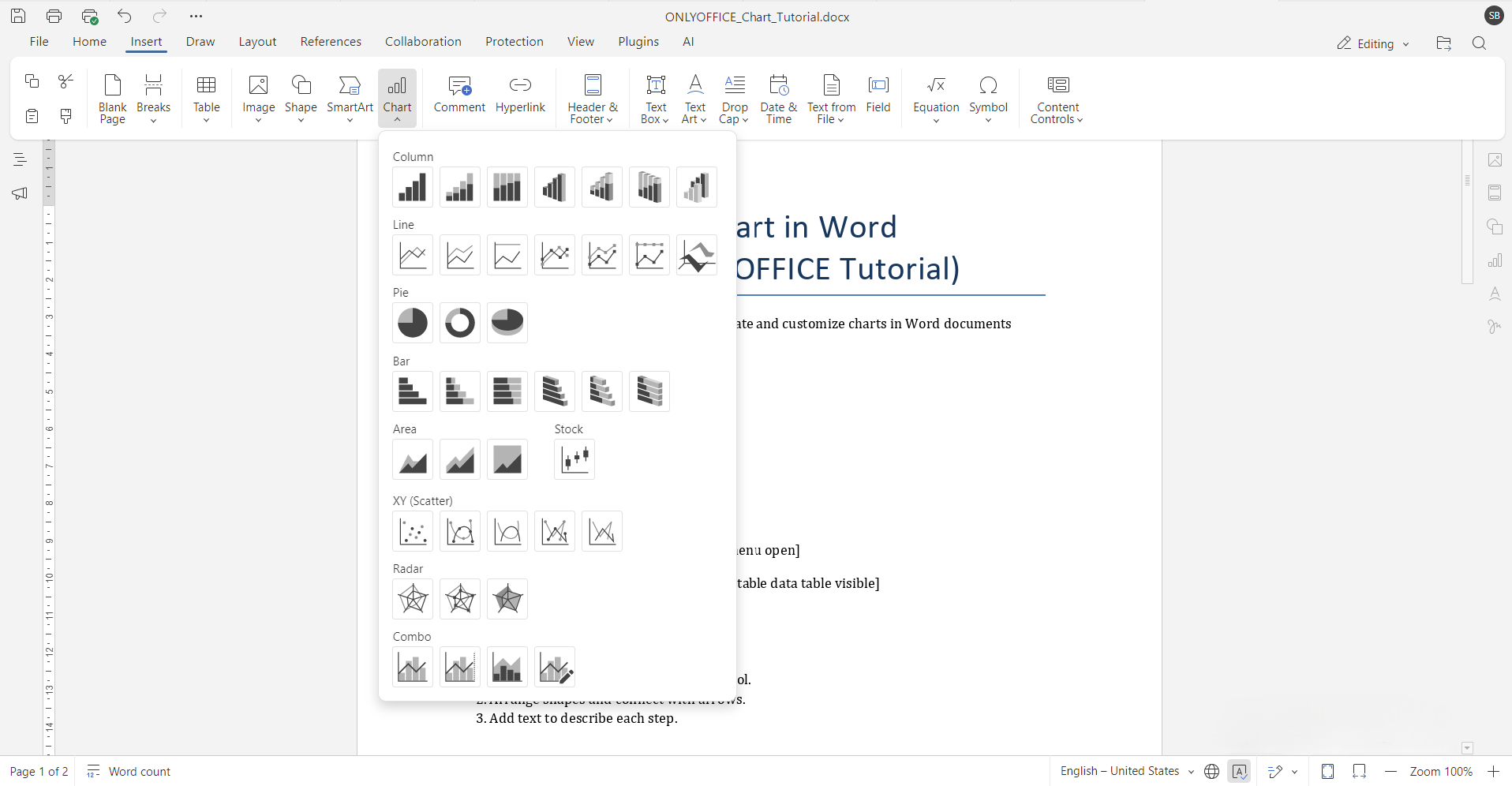
- Choose your desired chart type from the available options: column, line, pie, bar, area, and more.
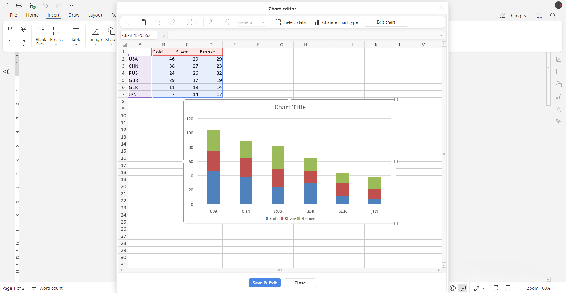
- A chart will appear, along with a spreadsheet-style data table. Input your data directly into the table, and the chart will update in real time.
How to create a flow graph
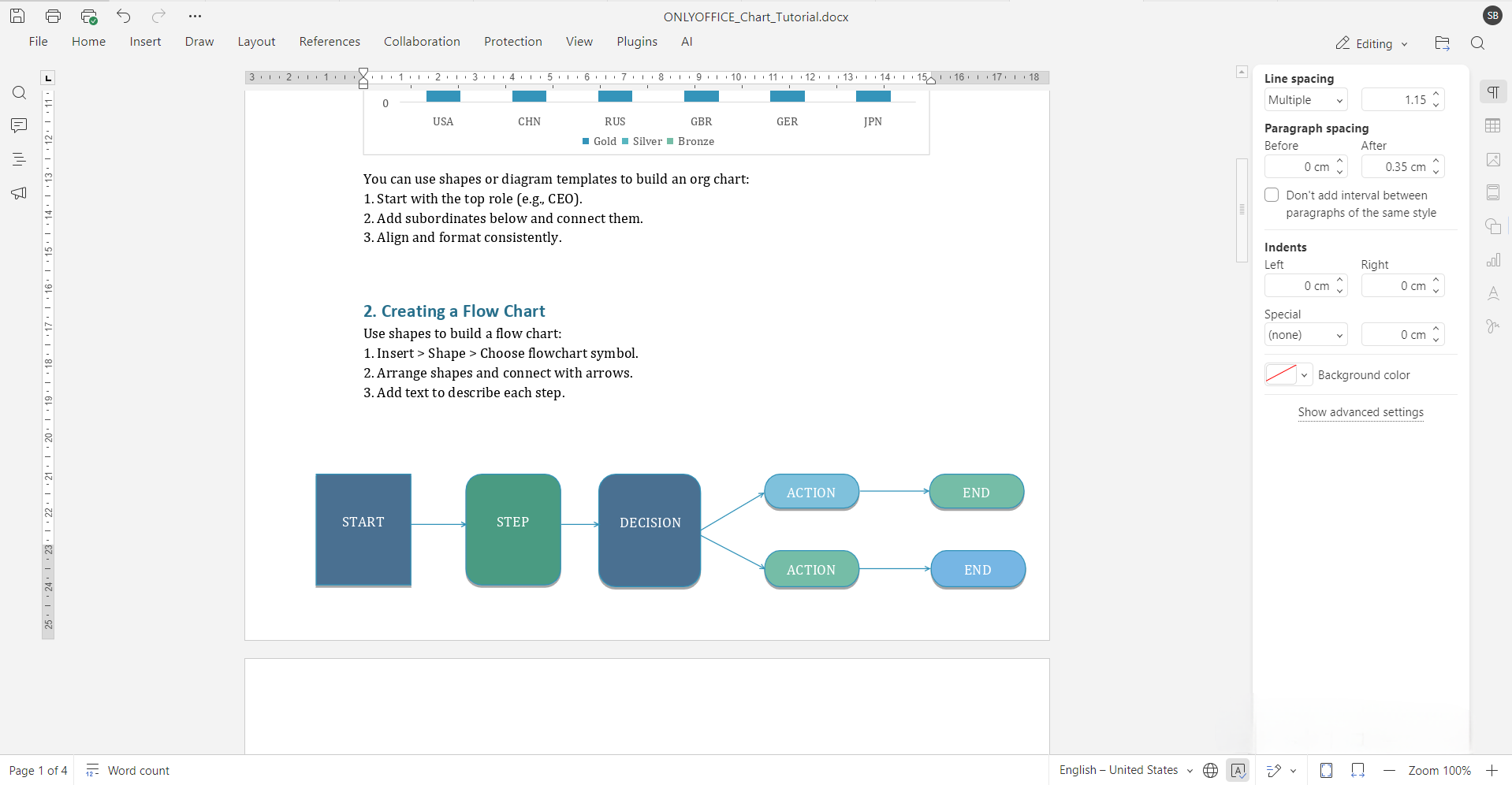
Flow graphs are ideal for illustrating processes, decision trees, and workflows. You can create one using shapes or predesigned diagram templates.
To build a flow chart manually:
- Go to the Insert tab and select Shape.
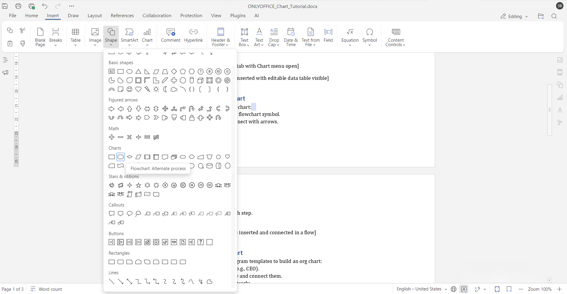
- Use standard flowchart symbols like rectangles (process), diamonds (decisions), and arrows to represent the steps.
- Arrange the shapes in the desired order and connect them using lines or arrows.
For more complex diagrams, many editors support integration with tools like Draw.io, allowing you to import detailed flow charts or create them from scratch using advanced features.
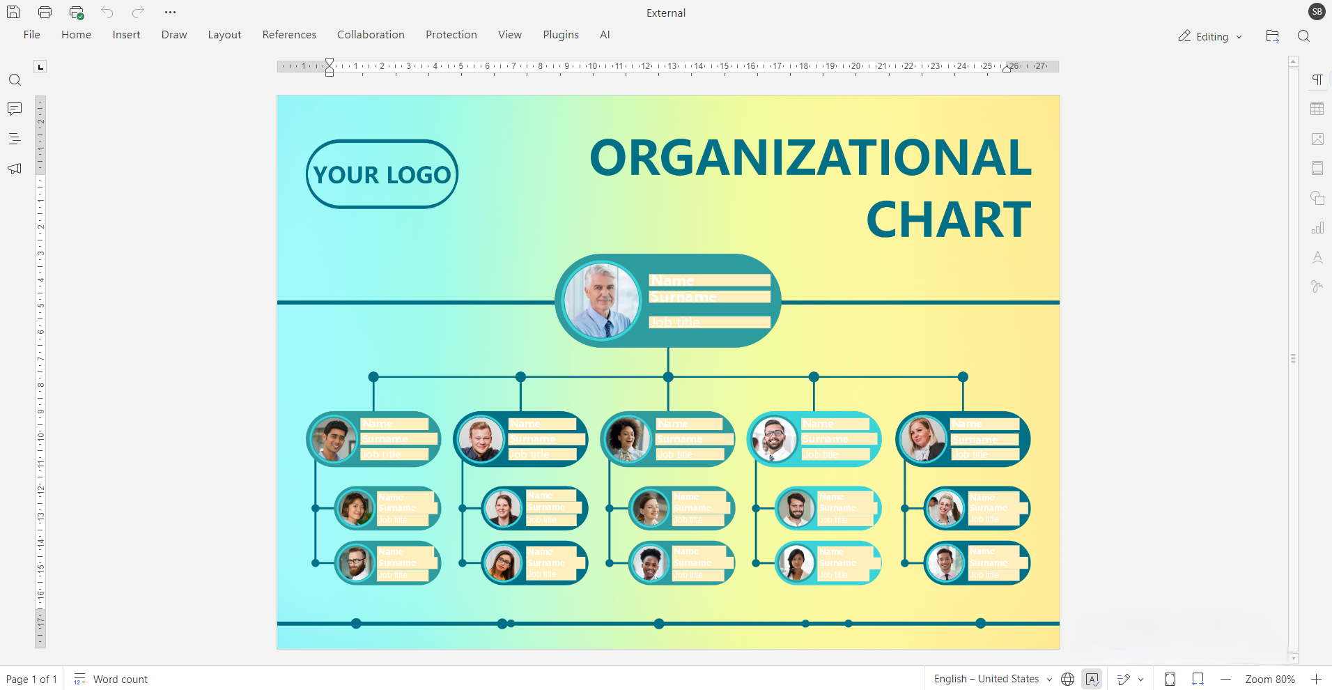
How to make an organizational chart in Word document
Organizational charts are useful for showing team structures, reporting hierarchies, or business divisions. While Word doesn’t have a built-in org chart tool like PowerPoint or Visio, you can still create effective ones using basic shapes or by inserting diagram templates.
Steps to create an org graph:
- Insert a rectangle for the top-level role.
- Add connecting lines to team members below.
- Use consistent formatting to keep it tidy.
Modern editors provide alignment guides and group editing features to help maintain a tidy layout. You can also explore diagram templates if you’re working with larger or more complex org structures.
How to make a pie graph
Pie graphs are perfect for showing how parts contribute to a whole such as percentages or proportions.
To create one:
- Go to Insert > Chart.
- Select Pie from the list of chart types.
- Input your values in the accompanying data table.
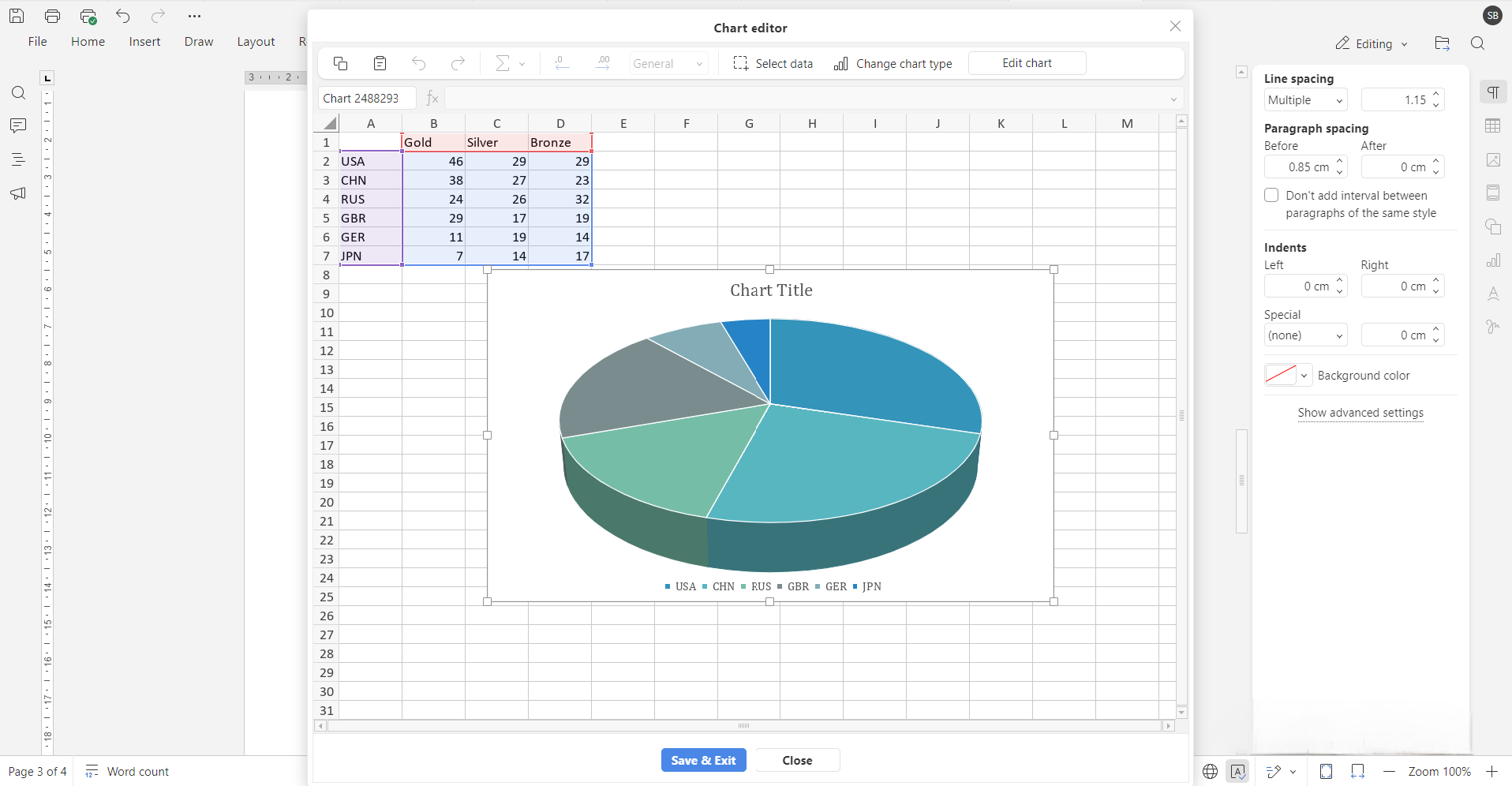
- Customize the colors, data labels, and title.
You can even explode individual slices to highlight specific segments of data, which makes pie charts great for visual emphasis.
How to add a bar graph to a Word page
Bar graphs are useful for comparing values across different categories, such as sales numbers, survey results, or timelines.
To insert one:
- Click Insert > Chart.
- Choose Bar from the available chart styles.
- Enter your data in the provided table.
- Adjust axes, labels, and legends as needed.
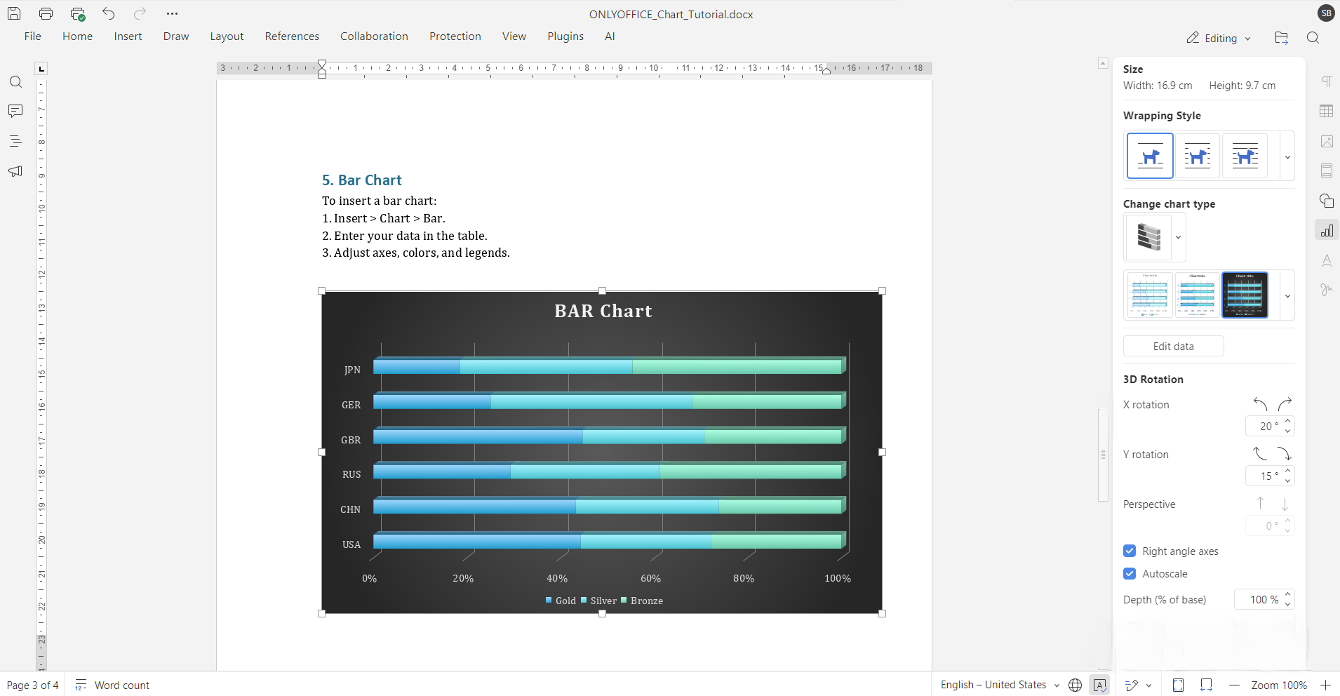
Use horizontal bars when category names are long, and vertical bars for simpler data series. Most editors make it easy to switch the chart’s direction and adjust the style with just a few clicks.
Tips for formatting Word charts for professional use
Creating a chart is just the beginning. Here are some ways to ensure your visuals look polished:
- Choose the right type of chart: Use pie charts for showing proportions, bar charts for comparing quantities, and flow or org charts for processes and structures.
- Keep it simple: Avoid cluttering your graph with too much text or excessive colors. Stick to a clean layout and consistent design.
- Use templates: Templates can save time and ensure a uniform design throughout your document.
- Customize wisely: Fine-tune chart elements like borders, fonts, gridlines, and color palettes to fit the document’s style or your branding.
Common issues and how to fix them
Here are a few common chart-related problems and how to resolve them:
- Chart not updating? Double-check the data source. You may need to reopen the chart’s data table to refresh values.
- Text labels are overlapping? Try reducing font size, repositioning labels, or expanding the chart’s size to fit the content.
- Wrong chart type chosen? Don’t delete and start over. Simply click the chart and use the toolbar to switch to a different chart style.
- Data misalignment? Ensure rows and columns in the data table match the intended axis and category breakdown.
Conclusion
Adding graphs to Word documents makes your presentations, reports, and proposals more readable and persuasive. With ONLYOFFICE, you gain access to modern chart types, intuitive styling, and robust diagramming features. Unlock your documents’ full potential with enhanced visuals, explore diagram templates or check out the new features in ONLYOFFICE today.
If you need a visual walkthrough, check out our short tutorial on YouTube:
Create your free ONLYOFFICE account
View, edit and collaborate on docs, sheets, slides, forms, and PDF files online.