What is a radar chart and how to create it in Excel sheets?
ONLYOFFICE Docs v7.4 comes with plenty of new features, including the ability to create radar charts in documents, spreadsheets, presentations and fillable forms. Charts of this type find wide application in different cases when it’s necessary to represent multivariable information. In this article, you will know how to create them in Excel sheets.

What is a radar chart?
A radar chart (also known as a spider or web chart) is a two-dimensional graphical representation for data visualization in the form of an irregularly shaped polygon used to compare multiple quantitative variables. As a rule, there should be at least three variables, each with its own axis. All axes start from the centre and are equally distributed. The axes are sometimes linked to each other to form various grids.
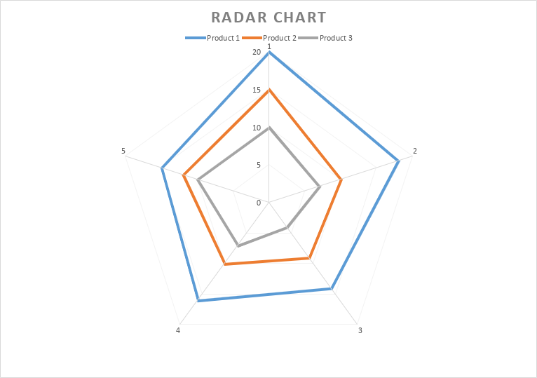
The above definition might sound too complicated. In fact, radar charts are quite easy to understand. Here is what they usually look like:
Generally, there are three types of these visual objects. Apart from standard ones, it’s possible to distinguish:
- Radar with markers — their data points are highlighted with markers;
- Filled radar — they are filled with colours.
All these types are similar, and you can use any of them to represent your information visually.
Why use radar charts in Excel sheets?
Radar charts are really helpful when you need to represent multivariable data. They let you see which variables have similar values and if there is an overlap. These are the most common use cases:
- Comparison. Using this chart type, you can quickly compare different items in one place;
- Analysis. Radar charts make it easier to understand how something is changed if you apply different parameters.
Based on the information depicted by a radar chart, it’s possible to make smart decisions in such sectors as sales, marketing, research, education, etc.
How to create a radar chart in Excel sheets
Now we are going to create a radar chart in Excel using the functionality of the ONLYOFFICE Spreadsheet Editor.
First of all, you need some data to work with. Imagine that you are the head of a department in a small company. All your employees are nice people and deserve promotion but there is just one vacant position. That’s why you can promote only one of the employees. Who deserves promotion most of all? A radar chart will give you the answer!
To get started, you need to evaluate your employees and their skills trying to remain as impartial as possible. The following parameters are subject to evaluation:
- Professional experience;
- Communication skills;
- Teamwork;
- Punctuality;
- Trainability.
Now you need to evaluate the performance of each employee by grading each parameter using a scale of 1-5 where 5 is the highest value. Now you need to complete the corresponding table in your Excel sheet. To create a table in ONLYOFFICE, go to the Insert tab and click Table.
Enter the values you have. When your table is ready, it will look like this:

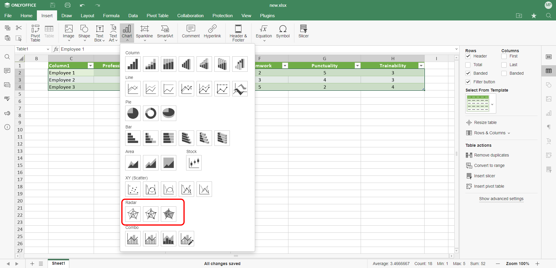
Now you have all the required data to build a radar chart. To do so, select the data in your table, open the Insert tab, click the Chart icon and find the Radar chart section in the menu. In this case, we are going to create a chart with markers but you can choose any of the available types.
When you choose the required type, the graphical object will appear in your Excel sheet.
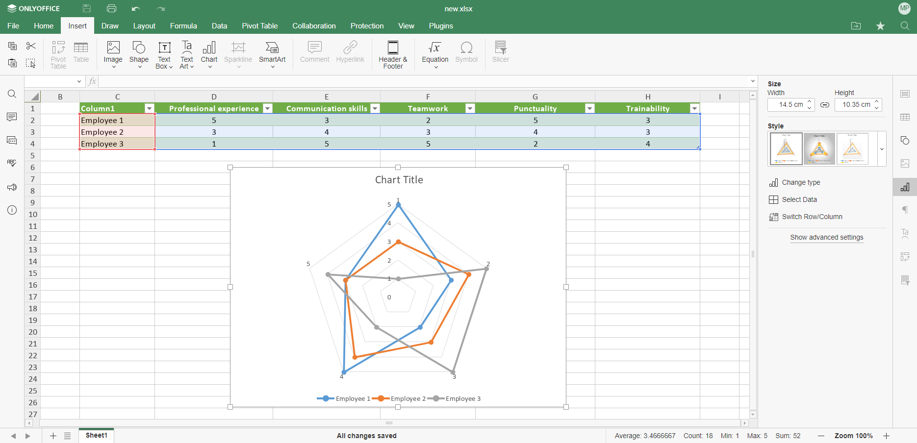
On the left-side panel, there are additional options. You can change the Size and Height parameters of the chart, switch rows and columns, access the Advanced Settings and even change its Style by clicking on the corresponding option. You can freely switch between the available styles to make your data look the way you want.

When it comes to Advanced settings, there are some sections that you can configure. For example, Layout allows you to set up the location of the chart title and its legend. To edit the chart title, you need to select the default text with the mouse and enter the text you want.
Using Advanced Settings, you can also adjust the parameters of horizontal and vertical axes, configure cell snapping and create a text-based representation of your visual object.

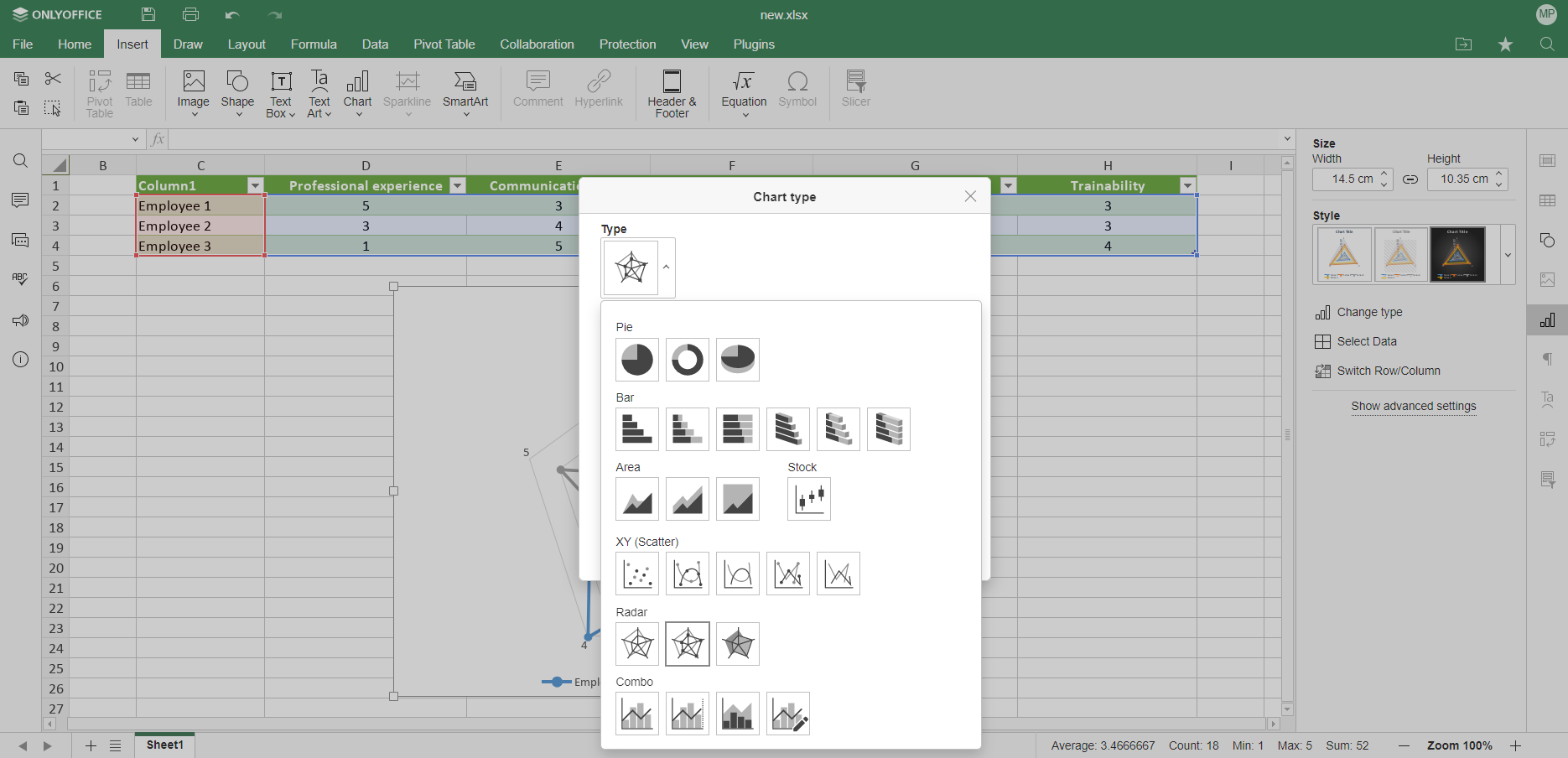
Another useful option on the left-side panel is Change type. Using it, not only can you change the chart style but also build a completely different chart based on your data. This option is useful when a radar chart is hard to interpret and you need another chart type to visualise your data in a better way.
Now that your radar chart is ready, you can quickly evaluate your employees. Employees 1 and 3 have some evident strengths and seem to be ideal candidates for the vacant position. However, they also have weaknesses that might be critical. Employee 2 has no strong skills and is more like a well-rounded professional. Now it’s up to you to decide who deserves the promotion.
Create radar and other types of charts in Excel sheets with ONLYOFFICE
Use ONLYOFFICE Desktop Editors for Windows, Linux or macOS, or create a free DocSpace account in the cloud to represent multivariable information with ease:
GET DESKTOP APP START IN THE CLOUD
Watch this video to learn more about the new version of ONLYOFFICE Docs:
Create your free ONLYOFFICE account
View, edit and collaborate on docs, sheets, slides, forms, and PDF files online.